Client
Client
Client
Tim "Timo_Redbeard"
Tim "Timo_Redbeard"
Tim "Timo_Redbeard"
Tim "Timo_Redbeard"
Date
Date
Date
2022
2022
2022
Role
Role
Role
Designer
Designer
Designer
Designer
Hey there, thanks for checking out my recent project...
For the best viewing experience please view this page on a modern monitor, while you can view on a mobile or tablet, content may be harder to digest. Thank you!
Tim, also known as Timo and Timo_Redbeard, is a Graphic Designer turned Twitch Streamer and Entertainer. As part of his recent achievement of becoming a Twitch Partner he wanted to create a new and refreshing brand for himself and his stream.
Tim wanted a minimalist, clean and modern design style to elevate his content, brand and influence. With a strong focus on his growing community achieved through audience oriented features.

PART 1
BRANDING
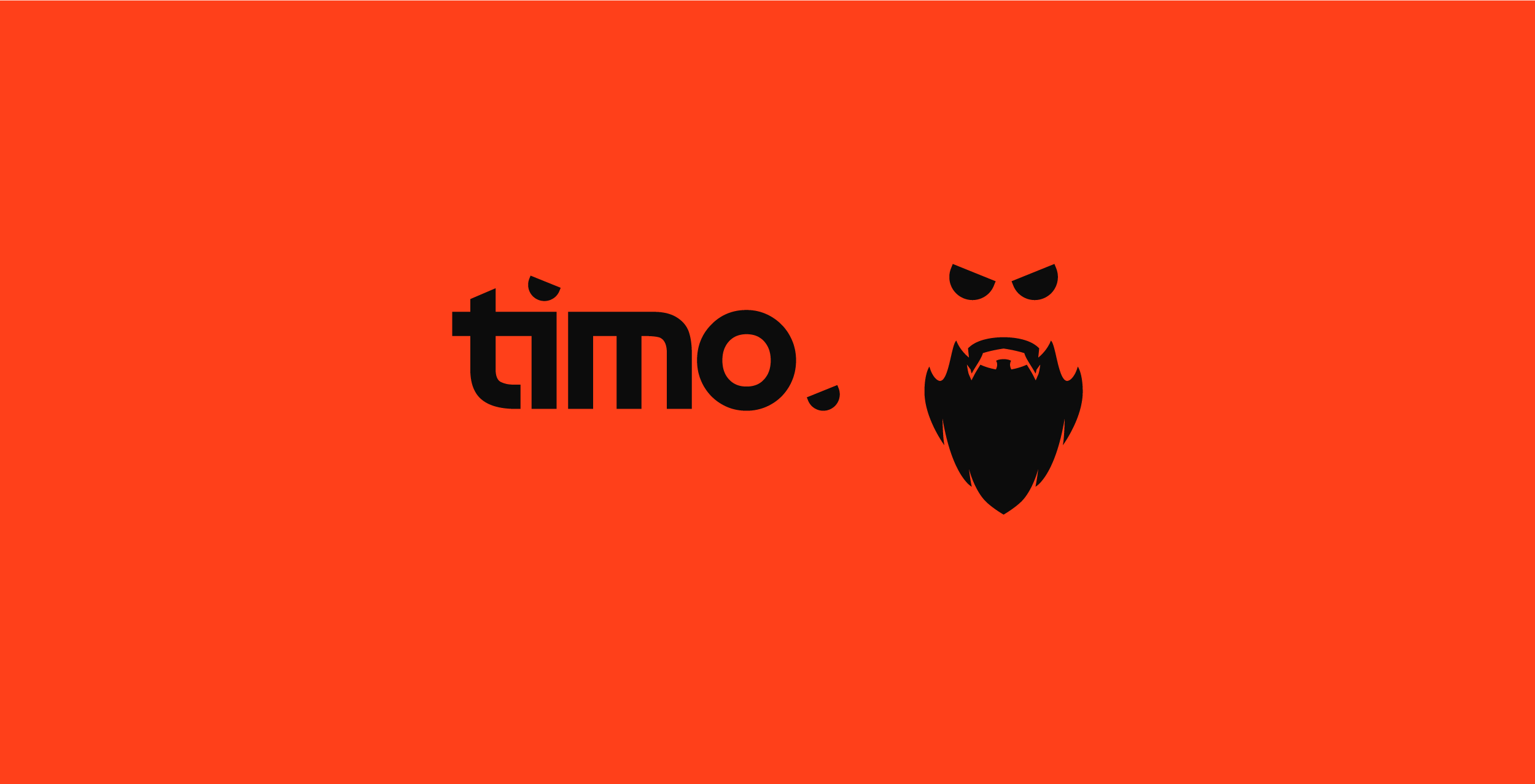
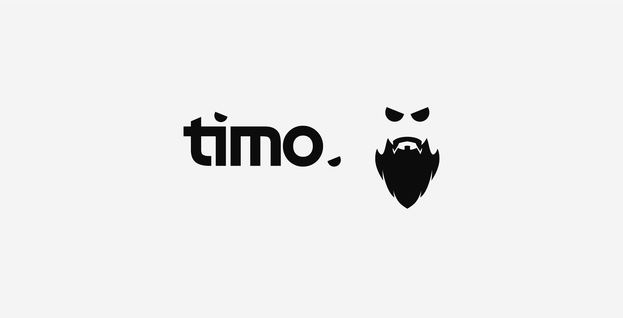
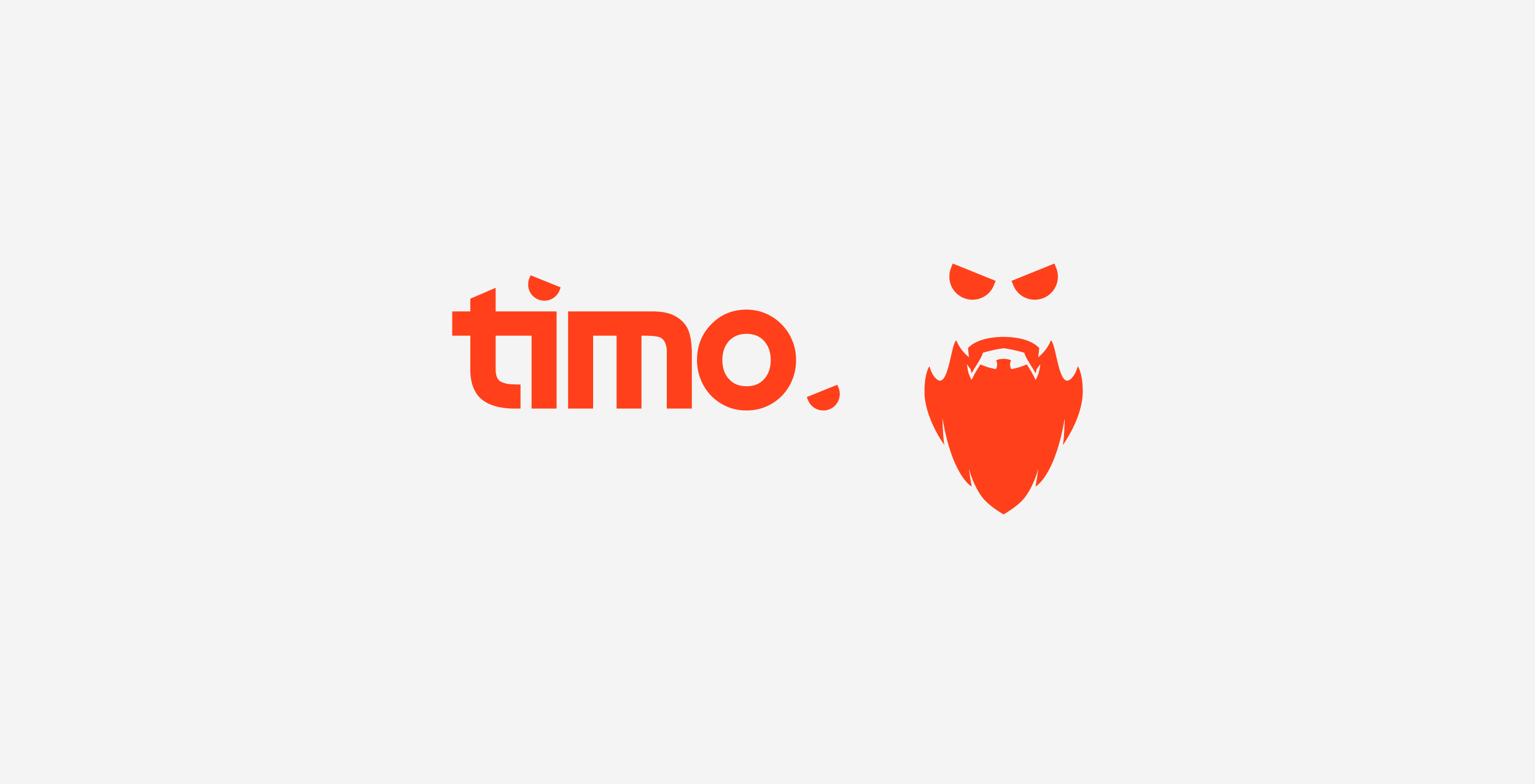
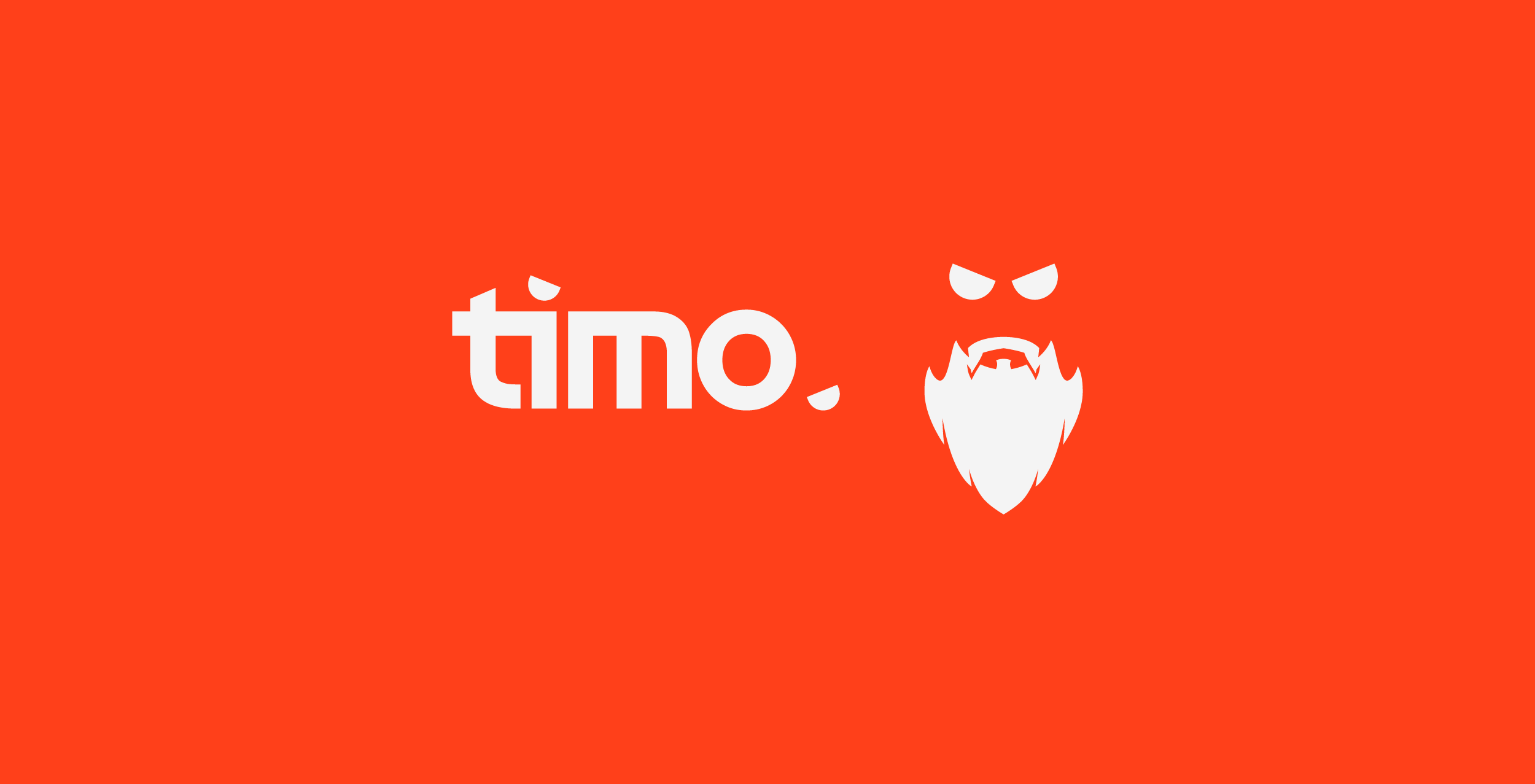
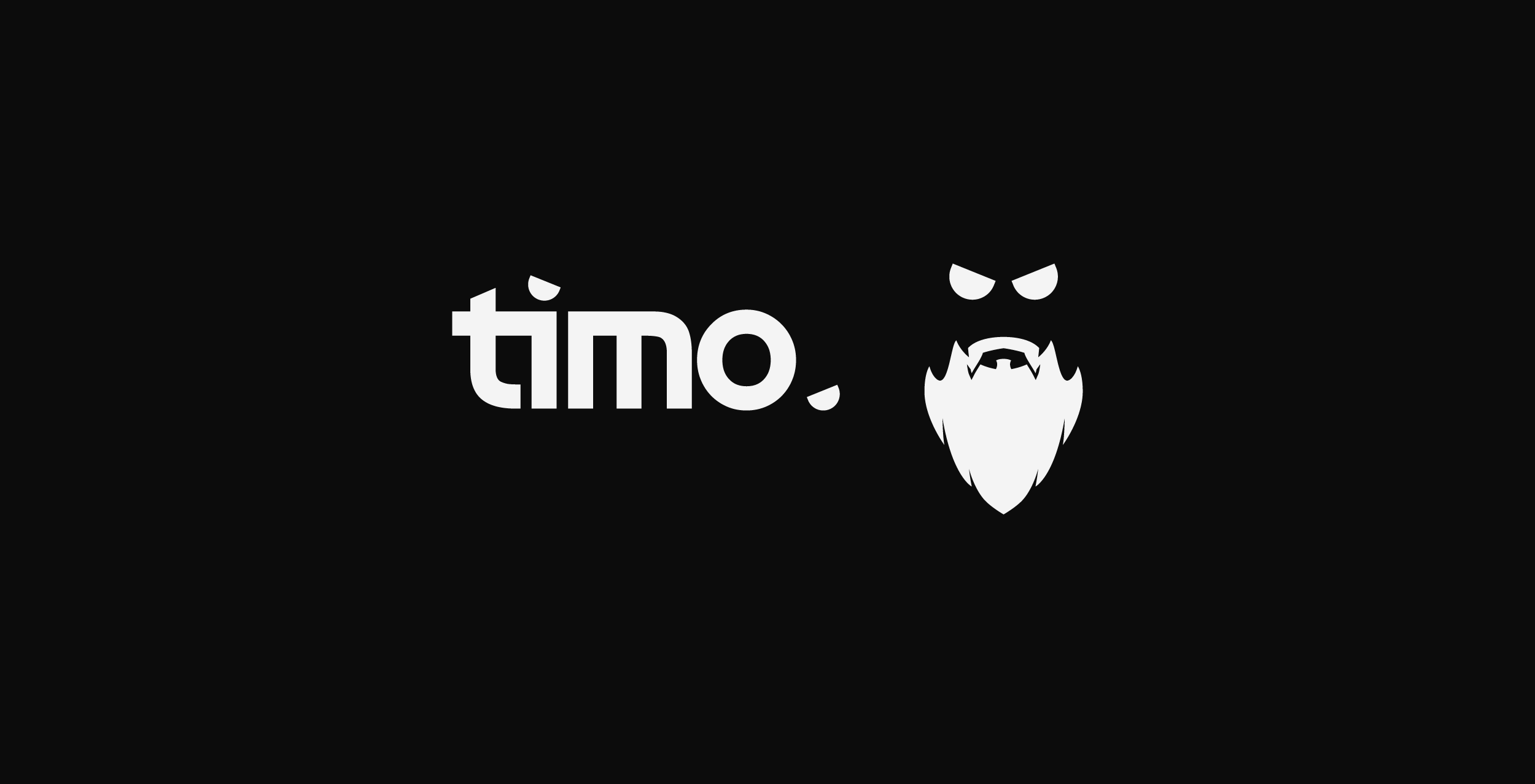
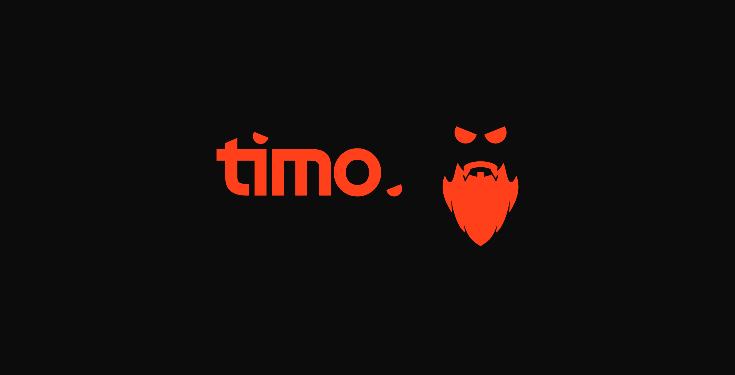
For Timo's logo I created a bold and modern wordmark paired with a simple silhouette icon which reflects Tim's beard.
We wanted the wordmark and the icon to work independently of eachother so I incorporated the eye symbols to work as the full stop and tittle respectively.
We went for a powerful electric orange colour to accompany the logo to convey the fun and electric personality of Tim, and the vibe of the stream.
It was important for Tim the mark worked across a variety of different colour schemes, and with the off-white, black and electric orange I think we achieved just that.
Brand Development
I presented Timo with a selection of Concepts, varied in style, to allow for a range of possibilities. Below are the concepts along with the notes provided to Tim.
Concept 1:
A bold extended wordmark with an integrated icon into the “O”. Featuring the “redbeard” value of the brand. Creating a recognisable and simple identity which would be extremely versatile as a full logo, independent wordmark, mascot or symbol.
Concept 2:
A more experimental concept, where the bold block lettering would form a symbol confined to a square layout. This could also be laid out traditionally to create a wordmark. Additionally, the knockout version (on the right) could make for a nice animated piece, rotating and shifting.

Concept 3:
A cleaner and modern take for a wordmark and logo. Pretty standard take for a professional logo, would be a timeless design piece which could be applied to different scenarios effortlessly. The tittle over the i and the full stop would make up the eyes for the icon part of the mark - paired with a beard to create a face.
Concept 4:
This monogram styled concept is based around featuring every letter of the brand name in a symbol. I included a couple variations to explore the possibilities of different shape forms. I’d imagine this being used along side a wordmark, where it would be less obvious but still recognisable.
Concept Development
Following the selection of the concept I proceeded to vectorise the icon mark and explore various options for the workmark. I included a variety of different typefaces from more traditional san serif to sci-fi and extended typefaces. This was primarily to explore what is on trend in the branding, and gaming content creator, space and to highlight possibilities for both Tim and myself.

In the end it came down to a variation of development six and eight. Both concepts have similar vibes and possibilities, however one is more on trend. We wanted a timeless and modern design, so we decided to proceed with the logo on the right as we thought the letterforms and overall feel achieved the goals.

STREAM GRAPHICS
PART 2
As part of Tim's rebrand project he wanted to overhaul his stream graphics to match the new branding and style. This included creating several stream scenes, stream elements and alerts.
While creating his stream graphics we decided to incorporate more dimension into it, creating a 3D model of the brand icon to accompany the graphics and deeply integrate into almost every end deliverable.
It was important for me to make sure that every scene in Tim's rebrand felt unique yet familiar, and with the stream graphics I wanted to push my abilities as far as I could, especially on the motion side. Utilising the 3D Logo Model, I created a subtle background effect which allowed the new logo to have a strong presence across the scenes, creating consistency across all the scenes, no matter the information provided.
Timo's Stream Intro Scene
Timo's BRB Scene
Timo's Stream Outro Scene
The big scene for his stream is the in-game overlay and the full cam intermission scene, these are the most prominent and vital elements of the stream, these scenes provide connection to the viewer, collating the important stream information, and most importantly the game itself.
The big scene for his stream is the in-game overlay and the full cam intermission scene, these are the most prominent and vital elements of the stream, these scenes provide connection to the viewer, collating the important stream information, and most importantly the game itself.
Timo's Intermission/Full Cam Scene
Timo's Intermission/Full Cam Scene
Timo's Intermission/Full Cam Scene
Timo's Intermission/Full Cam Scene with Transition to Outro
Timo's In-Game Overlay
Timo's In-Game Overlay is comprised of two core graphic elements:
1. Webcam
2. Stream Widget
The webcam is very similar in style to the full screen intermission, we wanted to create a familiar feel to create a consistent look, which is why you will find the timo silhouette cut out of a translucent bar on the side.
The stream widget (Powered by StreamElements) is an important element, it holds all the notifications, call to actions, subscriber and donor information, and consolidates it into a nice clean minimalistic bar, which in turn clears the screen of visual clutter creating a better viewing experience.
While developing the concept for the widget, which houses the majority of Tim's stream information we expanded this to include Call to Action popups, which would usually have been added elsewhere and take take even more attention away from the stream game.
I designed the call to action to be eye catching yet subtle, viewers attention would be drawn by the bright colours and animations. The system was designed to be easily updatable, and able to have new variations created and added in a short delivery period.
Timo's Call to Action Pop Ups
Timo's alerts follow the same design style as the call to actions, they're minimal and eye catching. We wanted to explore a couple of routes to add additional variations to the alert system, and by doing so creating more special alerts for different tiers of support.
Large, Medium and Small variants were created for both Community Gifts and Supporter alerts. Where as variants for the subscribers are dependent on the tier of subscription.
Timo's Stream Alert Pop Ups
Subscription Alerts Tiers:
1: Tier 1 Subscriber/Prime Subsciber
2: Tier 2 Subsciber
3: Tier 3: Subscriber
Supporter Alerts Tiers:
1: Small Supporter
2: Medium Supporter
3: Large Supporter
Community Gift Alerts Tiers:
1: Indiviual Gift
2: Small Community Gift
3: Medium Community Gift
4: Large Community Gift
Timo's stream transition uses the recent release of a Track Matte in OBS Studio, this allows there to be a seemless transition without a need for a full screen cover and middle point to transition content. This gave me siginificantly more room to develop a cool and unique transition for the project.
Timo's Stream Transition
VIDEO GRAPHICS
PART 3
As a content creator Timo understands the importance of expanding to other platforms and increasing his appeal, with this it was important to consider YouTube and TikTok.
We decided to produce several video elements that would increase the consistency across these platforms, creating a unified brand identity and style to his content.
Timo's YouTube Intro and Outro features all the styles from his stream content and transformed into YouTube appropriate deliverables. The content features alpha transparency to ensure intro/outro can directly be integrated into the video content without being disruptive or aggressive.
Timo's YouTube Intro
Timo's YouTube Outro
Timo's TikTok Outro
Timo also requested a TikTok outro video, which is a slightly modified version of the YouTube outro. With TikTok's platform and style in mind, it features a shorter transition and direct call outs to his other social media.
Timo's YouTube In Video Call to Action
Timo's Twitch In Video Call to Action
We also decided to create lower third pop ups for his video content to convert audience from YouTube to Twitch, and to encourage likes and subscriptions on YouTube.
It was important to consider the content that these pop ups would be overlaying, ensuring readability and appeal, so we applied drop shadows to elements to create depth.
ADDITIONAL DELIVERABLES
PART 4

Timo also required assets for social media and a couple of additional elements on his Twitch page, they all utilise the same assets and create a unified brand across the platforms.
I created brand banners for his Twitter, YouTube as well as an avatar which could be used universally. In addition to this I created an offline screen for his Twitch and stream panels for below his stream, including a icon for panels which link to external pages.


For Timo's Twitch subscriber badges we utilised one of the unused logo concepts. Creating a unique symbol which featured all the letters of "Timo" in a consoladated icon.

Credits
Credits
Credits
Chris Praoline - Graphic & Motion Design
Chris Praoline - Graphic & Motion Design
Chris Praoline - Graphic & Motion Design

Chris Praoline
Graphic Designer • London, UK.
imchrisp © 2025